What is SEO or Search Engine Optimisation?
SEO is an acronym for “search engine optimisation”
Simple short question – right? Yes, but the real answer is not really so short and it gets longer every day.

Our Free Guide to SEO in 2026 for Irish Professional Services Firms
Whether you’re a solicitor in Dublin, a financial planner in Cork, or a construction firm in Donegal, SEO can help your ideal clients find you online.
Our extensive guide covers how you use keywords or terms, the quality of your content written and photographic, your Paid Search PPC pay per-click or ads campaigns, and your Social Media output, the ability to share and be found for your content. If you agree that Google’s aim is to deliver the best answer to a given query, then your job is to deliver the best answer for them to offer the searcher. If you are getting your SEO right, then as a result, you will be getting the ‘right’ traffic to your website for your business. Basically, optimising is all about making the best use of your content, getting all you can from all you’ve got. The result for you is that you get enquiries from the people you want as clients.
Google rewards your individual pages, or a part of your page, possibly one sentence, if they deliver them in response to a specific search query, based on ‘intent’ more than simple keywords. And then the visitor may click to engage with your page by reading it and maybe clicking through to more of your pages. This is like a vote of confidence in that page, this response to a specific search term. Google is trying to deliver the best answers to any particular search terms. In 2025 Google will deliver a lot of these answers right in their search engine results pages. AI including ChatGPT search is trying to do the same thing. The free ChatGPT version now comes with Ads, just like Google.
Search Engines like Google or Bing or ChatGPT work by crawling websites using its ‘robots’ to crawl all the pages of all the websites. Google RankBrain is where its own AI artificial intelligence or machine learning ranks the pages they crawl to see which gets the best CTR or click-through rates. To stay ahead of other search engines, Google has to deliver accurate, well-liked results. Otherwise, Bing might make a comeback, which would reduce the spend in Google advertising. It all makes sense. Google even employs people, actual humans, thousands of them, to browse websites and rank them high or low in SERPs ‘search engine results pages’. These human quality scorers, just like Google’s Artificial Intelligence bots are looking the same things.
In 2026 we have to consider other search engine options such as Perplexity and SearchGPT and to an extent Duck Duck Go and Bing. These are now the underlying search platform for some of the LLMs Large Language Models, which also add their own modifiers. But most AI LLMs also use Google data. Yes, it is getting a bit complicated, so watch out for a serious reduction in your Organic traffic. AI Artificial Intelligence is a whole other topic and a much bigger one. And AI will totally change search in 2026. However, our prediction is that Gemii or Googles AI Mode will out perform Open AIs ChatGPT.
Not sure where to start? Book your Free 30-Minute SEO Strategy Call and let us assess your site’s potential – no obligation.
Over the past few months, many people have asked us these questions:
“What’s happening to SEO?” Search Engine Optimisation
“What is AEO?” Answer Engine Optimisation
“What is AIO?” Artificial Intelligence Optimisation also AI SEO
“What is GEO?” Generative Engine Optimisation
“How will Google AI Overviews or AI Mode and LLMs affect your website traffic?”
“What are you seeing across your other client accounts?”
“Is there a downward trend nationally in visitor numbers”
“How do we ensure our ideal clients will still find us online?”
These are the right questions to be asking and yes, the ground is moving dramatically – look at your monthly analytics reports or your Client Engagement Dashboard. AI Overviews and large language model (LLM) search engines such as ChatGPT Search are introducing new friction into a system we’ve had such a firm grasp on for so many years. The rules are not the same any more and attribution for visitor traffic is trickier. Google hides the actual numbers from AI platforms. Google ‘results’ will go through many changes in the coming months. Your ‘Brand’ or name search numbers will increase in analytics reports as people query their own ChatGPT results in Google before making a decision.
EEAT which stands for Experience, Expertise, Authority and Trustworthiness
Search engines like google score based on their EAT acronym, now ‘EEAT’ which stands for Experience, Expertise, Authority, and Trustworthiness (more on EEAT below). Looking at any particular website page, does it clearly show expertise in the industry, are you seen as an authority, where other people in your industry link to your page and do you have positive reviews, testimonials, or case studies? Is there clear proof that you are good at this service? Google has its own ‘knowledge graph, where it identifies ‘authors’ and ‘original content’ or ‘Helpful Content’. This is not open to us, so it is only supposition at this stage by us, however, we do feel that Google has been building up its own knowledge graph, which it does not share with us. Their knowledge graph then has a knowledge graph for all the ‘entities’ it can find. Then they connect the dots to content related to any given ‘entity’. Any new AI search players will do something similar.
Should I pay for Search Engine Optimisation in Ireland?

Every website built should be submitted to the top search engines, mainly Google for us? Some people are using Bing and so many will now start with ChatGPT or SeacrhGPT or Perplexity, so the landscape is definitely changing fast. However, simply submitting pages to Google does not mean that your site or page will rank high at the top of a search engine when a user searches for content related to your service page or website. A lot of work and research goes into getting your website or web pages or a part of your web page content to rank highly. Google ranks pages rather than sites. In fact it ranks parts of pages, segments, sentences, effectively answers or fraggles to a given query. And as of 2025 the results are shown very differently. What may have been the 5th link in the SERPs Search Engine Results pages may now be the 18th or worse. Google fills the top of the page with ‘in page results’ to queries, such as AI overviews, along with their relevant links in case they are required. This pushes everything else further down the page. Confused already? You may well need to engage an SEO specialist.
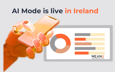
In mid 2024 Google released ‘AI overviews’ which is a better version of SGE Search Generative Experience. It allows people get an answer to their search term without leaving the search results page – and that is Googles goal. This does create a challenge for SEOs who are optimising for top of the funnel searchers. But it is a good result for the person doing the search as they can get answers in Google without having to click to a variety of websites. In 2025 it launched AI Mode in Ireland, probably as an optional choice at first, because it is far from perfect. And because people like the familiar way of using Google search.
SEO & Marketing Partners
SEO specialists are supposed to be experienced and should have proven success in Search Engine Optimisation in Ireland, so talk to one about what you need to do to manage your FREE marketing on the web or who can do it for you at a price. We recommend using good independent SEO & Digital Marketing Partners, at least initially, until you understand how search engines and AI really work and what needs to be done. Find an agency with happy clients and great local reviews. Think of it as an investment in your business and/or your education. Why pay less when you can pay more and get better returns, as in Sales or Leads? You pay commission to your salespeople – the more they sell the more they make. And that seems fair. Do set targets and measure results.
Note: This work does not ‘guarantee’ listings on search engines as they alone determine who they will list high up and who they will not.
Recommended Reading – Read all about it in 182 pages, Google Search Quality Evaluator Guidelines. There is no big secret! Updated on September 11th 2025 by Google.
This article you are reading here right now is well over 5,500 words long. And it just scratches the surface of SEO best practices. Plus we add further guides here to related SEO topics, such as AI or LLMs, Local SEO or On Site SEO.
_________________________________
Warning – Take Note before you start.
 There is no point investing in SEO to drag people to your website, if you have nothing valuable to offer. Keep your money, do not listen to all the shysters peddling ‘SEO’ services without any guarantee of results. It is not a magic bullet for flogging rubbish. (Or rather it should not be).
Likewise, even if you have something of value to offer, you need to ensure that your website is engaging and easy to navigate. Get the website and its content right. Check the user interface, is it easy for visitors to find what they want? Will they engage with you, if you get them there?
Why would I use SEO?
Whether you’re a solicitor in Dublin, a financial planner in Cork, or a construction firm in Donegal, SEO can help your ideal clients find you online.
If you want to increase traffic to your website you will need to understand the importance of how SEO works.
If you want your online venture to be successful, you need an effective technical and marketing plan which, should include SEO.
For companies looking to conduct business online and establish an online presence, search engine optimisation is paramount.
SEO is the perfect way to drive qualified customers directly to a website via search engines and directories.
SEO for Smaller Businesses in Ireland
For smaller businesses with limited marketing budgets, SEO is a very cost-effective alternative to high-priced offline advertising like getting posters and flyers printed up or advertising on radio or in newspapers and magazines. And it is a lower-cost option than paying for traffic through Google or Facebook ads. Using AI to generate loads of content is not the same thing as doing SEO. Done well SEO can allow you compete with whoever else is in your space. That includes bigger competitors. The trick is to do a better job than your competitors. And ensure that you continuse to stay ahead of the competition. It is an ongoing process. As you nudge ahead of your competitors they will eventually notice and respond with improved SEO too. But the playing field is obvious so you can stay on top by implementing better SEO. The return on investment should be huge, IF you get the right local SEO partners. If you hire an agency that does not get results, replace them with another one, until you get it right.
SEO for Larger Companies
Larger companies already recognise that SEO is becoming increasingly important as customers use search engines to shop online or to look for information about products and services or companies. The web is the window for people to browse, search and do price comparisons or other research before buying. Most buying decisions are made after browsing, then the purchase may be on or off line.
With Google Ads you can reach people when they are actively looking for your products and services – showing clear intent. That means you receive targeted visitors and customers. Cost-per-click pricing means you only pay when people click on your advert and with a little bit of study it is easier to control the ever increasing ad costs, to ensure that the people who click do actually want to see what you have to offer. Google Ads is an ‘auction’ so the prices are always going up. http://www.google.ie/ads/
What does SEO or SEM cost in Ireland?
Time, just time, so you can use your own time or pay independent, experienced, qualified people who can use your website and web presence to do your SEO for you. These people can get to your Target Market and show you measurable results. The good news is that you can now advertise effectively to your own chosen Target Market and measure the return on your investment. What a great leap forward for all businesses, big or small. Gone are the days of paying ‘mad men’ type money to spray and pray on television, radio and in newspapers or magazines. Nevertheless expect to get quoted anything from €250 to €2500 to €25,000 a month for SEO services for small businesses, depending on how competitive your market might be. The best price for you is the one that delivers the best results, which is usually not the lowest price option.
Tip: Read more about how to make SEO work for you, what SEO Costs are, advice, tips, tools, and some recommended reading, go here.
Tip: Page Title display limit or recommendation, keep it to about 60 Characters and limit Meta Description to 150 Characters. Add Keywords and synonyms for good measure
SEO Costs | Advertising with Google Adwords | Our SEO Plans | Digital Marketing
Types of SEO explained – Search Engine Optimisation Ireland techniques
Primary SEO – Technical and On-Site Search Engine Optimisation for your Irish website
“Buying a website without search engine optimisation is like spending your entire budget on creating a TV commercial without buying any air time to show it to the world“
Get some SEO recommendations and make the changes to optimise your website content, every single page, for your target market to attract and convert more visitors. To have people stay on your site and buy something or make contact with you. Just like a brick-and-mortar store, this web window attracts visitors, so do make your display and the messaging clear and appealing. If you are selling ladies shoes, you do not want people walking in who want mens hiking boots. And when someone comes into the store or website, you do not want them to leave or bounce out again without finding what they wanted to buy.
Typically, as an SEO agency we like to look at the history of your business, any web presence you already have, and that of your competition. This is where you need to be competing. Then we want to plan a personalised approach to optimise your website to include:
Technical SEO Audit
We need to check for technical errors such as bad forms, 301 redirects, sitemap, duplicate content, error 404 issues, lack of image Alt tags, bad image size or format, and broken or unfriendly links. Has the content obviously been created using ChatGPT or AI. Does your content add value to the reader? The website needs to be crawlable for Google so that it can index it and rank your pages. An SEO Assessment is also a good option, to get a baseline report before starting. Everybody needs a plan, before starting off.
SEO Keyword Research
Using the Google’s FREE Keyword tool or planner we can find and use the most logical keywords for your business and locality. Using other sources such as Wikipedia or specific forums, to research keywords and terms works very well. This is a critical first step, before creating or optimising any content. There are ‘paid’ tools that do this too, such as Semrush, Ahrefs and Ubersuggest amongst a long long list of other tools.
SEO Keyword Selection
Using the right Keywords or keyphrases we will typically place them in the correct designated pages. These keywords or key terms can be very competitive such as ‘red shoes’. So we try to get long-tail key phrases, with 4 or 5 or 6 words, to reduce the competition and increase our page rankings. Red shoes would be very generic and competitive, whereas ‘red patent leather pumps’ would be much more specific. And more specific again would be something like ‘red patent leather pumps size 4 with a mid heel and an ankle strap’.
Tip: Do a search for a key phrase and look at the bottom of the results pages to see what Google offers as ‘related’ terms. Read our short FREE Guide to Keyword Analysis. Your chosen key phrase will usually appear in your URL, page title, meta description, H1, and in the first and last line of the text, if possible.
Content SEO Recommendations
This refers to the creation of useful content where specific keywords or related words need to be used in useful articles or posts, that give value to the reader, when they find your page.
Meta Tags Creation
Website Title Tags, Meta Tag Description, Page Title, H1 & H2 Tags, and Image Tags & Alt Tags for each page are all important, as they help ensure you are pitching a clear message about what you are offering. Avoid the guy who wants hiking boots if all you sell is ladies shoes.
Additional On-Site SEO Changes
Check for or create a logical XML sitemap and user-friendly URL structure for your website, then recommend changes that could be made to improve your SEO.
Implementation of SEO changes
An SEO agency can recommend these changes and then you or your webmaster to make the changes. Or they can do it for you.
Link list
Generate a list of all inbound links to your website to ensure they are good quality or find useful new links to use. Getting mentioned in authority sites with a link back to your site gives your site a lift in authority too. Keep the list updated. Disavow any ‘toxic’ links.
Secondary SEO – Off-Site SEO Link Building and web promotion, as in Online or Digital Marketing
Develop a strategy to include:
Online Marketing & Publicity
Creation and distribution of your news or content. What have you created that is worth sharing? And where should it be shared or promoted?
Social Networking
Registration and populating of any useful mediums such as Facebook or Twitter/X, Linkedin or Instagram, Pinterest, Tiktok or Trip Advisor etc. If people share your content it will help it to rank higher in search. Publish relevant ‘shareable’ useful or entertaining content to engage your target audience.
Localised Search
Whether you’re a solicitor in Dublin, a financial planner in Cork, or a construction firm in Donegal, SEO can help your ideal clients find you online.
See our short guide to Local SEO. It involves the creation of business listings in the top local or logical portals & directories. Just do a search for Local Directories or FREE ‘web 2.0 submission sites 2026 and add your exact NAP Name Address Phone number to as many as you can. When these Directories try to sell you premium listings just decline. Imagine your own website is Web 1.0, Web 2.0 simply refers to other websites, where you can post details or links to your own website. Ensure you have your NAP Name Address and Phone number right in Google Business Profile (previously Google My Business) https://www.google.com/business/ Bing Places https://www.bingplaces.com/ Apple Maps https://mapsconnect.apple.com/
Blog Commenting
Create and populate your Blog or online news publication, with useful relevant helpful content. Mere words will probably not rank or rank for long, it has to be ‘helpful original content’ if you want it to rank in the long term. Search engines want to serve up the best answer to any given search phrase.
YouTube & Flickr Image & Video Marketing
Creation of Youtube or Vimeo accounts to allow you to promote business-related videos or images across these other search engines. Select the one or ones where your target market hangs out most. Again this is a great opportunity to show authority. Youtube is the second biggest search engine today. Google loves to see you use video. And many people watch short form video rather than read written answers to a question.
Associations Society and Industry Websites or portals
Add entries to industry portals with the exact same NAP number, address, phone number, and postcode. All you are doing here is confirming your existence to Google or any search engine. These directories do not usually deliver enquiries, but some do. They add authority for you.
Content Writing and Marketing
We can create engaging material to attract and convert visitors to our site, adding well researched articles, that are well laid out, to help keep the visitor engaged. Ideally right up to the point where they buy something or make contact with you. Anyone can use AI tools like ChatGPT or Gemini to help with ideation and even content creation to some extent. Relying totally on content generated using AI tools will save you time and expense, whilst probably ruining your SEO and online credibility, if done poorly. Google can identify this content as waffle and of no help to the reader. It can also reward the AI content if it is good and answers a query well. So it can be a double edged sword.
Graphics
Invest in some good Graphics and InfoGraphics or video to support any written content. You can use royalty free images or images created by tools like Gemini, Sora, Dall-E 2 or Midjourney. Or paid for stock images, which are usually very ‘generic’. The best option is to get original photography done by someone who knows what they are doing with a camera or the tools.
Pay per click
PPC Pay per click or CPC Cost per click options researched and set up with tracking if deemed worthwhile, can help attract traffic. Or you can use this format to test content, before promoting it. PPC is or will be an expensive choice for you. It is an auction and can only get more and more expensive as people compete with their wallet. And it only works when your credit card is attached and paying for every click, every day, good or bad.
Backlinks
Where they make sense from authority sites. Links are votes of confidence in your content. Can you get any free-of-charge links from relevant authority sites? You can pay for these, but the fact that you have to pay says so much about the source quality of such a link. Backlinks are important, if they are from logical, relevant, high authority and trusted websites.
Logical creative CTAs
Call to action CTA to help guide visitors from page to page. For example ‘Contact Us’ or ‘Download our FREE Guide’ or ‘Ask a Question’ etc. Actually when did you last download a free guide? Maybe just put the content of your guides on the page and give people answers without the friction of having to download anything to read. PDFs are generally not a great addition to most websites.
SEO Jargon translated
Proof
Independent Reporting from Google Analytics will show you how well your site is working as a result of work done by you or an SEO agencly like us. The work done by SEOs is generally ongoing and is billed by the hour. Results are ongoing and can be measured to show that any investment generates good returns. Talk to us or competent SEO practitioners about what you want to achieve via the web. Results should be clearly quantifiable. There should be no hiding for SEOs.
SERPs
Search Engine Results Pages, are the 10 ‘organic’ results pages you get when you do a search for a word or term. Usually below the Google Ads and Google Maps results. At the same time Google is delivering more ‘Rich Snippets’ or ‘Featured Snippets’ in a results page. Nowadays that is AIOs or AI Overviews. And as of late 2025 we have the AI mode option. Effectively it is delivering the ‘best’ answer to a given query, even if that is just one line from one page on one website. We do not have to click through to the website to see the answer, Google gives it to us on the results page. And soon a click is likely to bring you to that exact line on the page in the website. In March 2025 we saw Google AI Overviews pretty much replace Rich Snippets. And since October 2025 AI Mode replace AIOs, if you choose that option.
Google Algorithms
Programmes are written to see if your content answers the question in search and if is it well structured. There are hundreds of these qualifying pieces of code working for Google as they search their own index for the best answer to any given search.
Google Algorithm Updates
Google regularly updates its algorithms to improve search results and counter any black hat SEO. They make a full list of Google Search ranking updates available, with cute names such as Panda in 2011 or Penguin in 2012, Bert in 2019 as well as Medic and Multitask Unified Model or Mum in 2022. Google also adds non-core updates such as the Helpful Content Update in August 2022. 2023 was a really busy year for Core updates and another Helpful Content update in September 2023 to account for the mass usage of AI. The Core update in November was another. In 2024 we had one in March, August, November and December. In 2025 we saw one in March and one in June and again in August and December. You can expect a core update roughly every quarter, as Google try to punish spam or lightweight content.
Local SEO
The process of ‘optimising’ your online presence to attract more business from relevant local searches, rather than National searches. A good example would be the local Pizzeria or Garden Centre. You want to optimise to be appearing in the Map stack at the top and Google Business Profile knowledge graph on the right-hand side of a search of the page. See our short Local SEO guide packed with useful actionable tips.
Keyword or key term
These are the words or terms you use on a page to optimise to get found in search when someone uses them. For example, this page ranks well for the word SEO or the term ‘what is seo’.
Different Types of Keywords
A single Seed Keyword
a seed keyword is a one-word keyword that is a noun or entity such as ‘painter’. This will be hugely competitive.
Variant Keywords
a variant keyword is a keyword that uses a different suffix or prefix but is still related to a seed keyword such as “Painting”
Adjective-Based Keyword
an adjective-based or descriptive keyword is a keyword that pairs with an adjective such as “Best Painter” or “Professional Painter”
Interrogative-Based Keyword
an interrogative-based keyword is a keyword that pairs with an interrogative or question with who, what, when, where, why, and how, such as “How to be a painter”
Location-Based Keyword
A location-based keyword is a keyword that pairs with a location. An example would be “Dublin Painter” or “Donegal Painter”
Keyword “Modifiers”
is a term for any word that helps modify the head noun or entity of a keyword such as size, location, colour, etc. “Dublin builders” or “House Builders in Rathfarnham Dublin”
Long Tail Keywords
A term for any phrase that contains a keyword, paired with adjectives, interrogatives, locations, etc. The term ‘what is seo’ being used in the search is obviously longer than just the single ‘seo’. So that is long tail, although usually long tail would include more words, such as ‘What are the best SEO techniques to use with a WordPress website’. Getting found for long tail is less competitive than just the single word. And you might be able to optimise for people who want a very specific product or service. Yes, it is more complicated and may need more work. Try using Google Ads to work out if people click your proposed term. And check in Google Keyword Planner to see how many people search that term at all. NOw people use longer search terms as they talk to their AI apps or digital assistants.
Note: Creating a lot of content around a keyword or phrase will not necessarily rank a page. Google is looking for an answer to a query, not a book. It will generally deliver the best answer, such as one line of ‘helpful content’ on a single page in a website, rather than sending the searcher to the actual website page. Even if your answer is served up in the results you may not get the click as a result. And yes this Zero Click Search is reducing clicks, visits and page views. So in many ways old style SEO is being replaced, as Google gets better at serving up the best answer to any given query.
Keyword Cannibalisation
This is where you have two or more pages optimised for the same keyword or key term, which will dilute the effect of your optimisation work and confuse Google. Typically a page should have one major focus key term, supported by secondary or related terms by all means.
This is a big topic, so if you need to dig in to it, here are some useful articles on the subject:
https://seotesting.com/blog/keyword-cannibalization/
https://ahrefs.com/blog/keyword-cannibalization/
https://www.semrush.com/blog/keyword-cannibalization-guide/
https://www.themetablog.io/content/planning/identify-keyword-cannibalization/
Keyword Research Tools
These include paid options such as SEMRush, Majestic, KWFinder and Ahrefs , Keywordtool and SpyFu, if you want something other than Google Keyword Planner. Some FREE options include Ubersuggest or Answer The Public or Keyword Sheeter for a way of getting suggestions on your term. Or Also Asked which tells you what else people searched that relates to your term. Remember that as you start typing any term in a Google search, it will start showing you suggestions. And at the bottom of the page, it will show you ‘people also asked’ showing some related terms that have been searched by others. Read our Keyword Analysis Short Guide to learn more.
Tip. And look at your competitor’s websites to see which keywords they are focusing on.
Google Search Console
A FREE Google tool that helps you monitor, maintain, and troubleshoot your website’s presence in Google Search results to help you understand and improve how Google sees your site. See full details HERE. Previously you may have known this as ‘Google Webmaster Tools’.
Technical SEO
It is just making sure that robots or search engine crawlers or people can browse through your website with ease, and that it is well structured, laid out, and connecting or linking internally. Which pages should robots crawl and not crawl? Whilst robots are important, write content for humans and be aware of scenario-based search versus keyword-based search. People ask an actual question, rather than simply entering a keyword or two. People are using speech search more and more, so they will ask a question of Siri or Cortana as they would ask each other. This leads to longer tail search queries. This is a great opportunity, as many keywords or short key terms are very competitive in search, so get more granular by using longer terms and start optimising for these now. Morningscore.io is a new tool to play with for SEO.
On-Page SEO
Simply where we ensure that we have a logical page title and good relevant unique content and it is easy to see what the page is about, as in the main targeted Keyword Phrase eg: What is SEO ? – add Meta Description and Keywords for good measure and Alt tags to images, plus linking obvious words in the text to related articles. Focus on just one term or phrase per page, mentioning it in the Title, Headers, and content. Right wording, placement, and relevance will keep a visitor reading. Avoid using your keyword or term too much and use similar or related words in the text. If you are using a plugin such as SEOPress or Yoast, watch their video tutorial. Or try Page Optimiser Pro. Refresh your knowledge on an ongoing basis, because SEO best practice is ever evolving. Read our short guide to On page SEO Tips.
Off-Page SEO
Is having people mention your site content and share the link in their own site. You can have clients or followers, forums or blogs link to your content. When you share useful content, people will also share via Twitter/X or Facebook and link to the content from their own sites. Google rewards such linked mentions, as it adds to your credibility or authority. This is said to account for up to 50% of your ranking according to Moz, which Google might dispute somewhat. Whatever the figure for backlinks, it is a major ranking factor.
Entity-based SEO
Entity Based SEO differs from simple keyword or keyphrase SEO in so much as it strives to deliver answers to queries based on context or meaning. Therefore Google helps the searcher find the ‘entity’ that it is looking for. Information or answers can be pulled from the Knowledge Graph or Wikipedia or anywhere that information can be found about any specific entity, a noun, a place, a product, an organisation, anything that can be defined as such. Promoting ‘entity awareness online’ is a key aspect of SEO for 2026 and beyond.
White Hat SEO – Black Hat SEO
Simply put, people who engage in Black Hat techniques are bending the rules,whilst White Hat practitioners are doing it right. If you let someone use Black Hat shortcuts and Google recognises them, your website could be removed from the SERPs Search Engine Results Pages totally, doing massive damage to your website an your business – you have been warned.
Note: Most SEO agencies do use black hat. And that is bad for your website health in the long run. So, be choosy about who you work with, as you are ultimately responsible for your own web presence.
Schema or Mark up
This is a semantic vocabulary of tags or microdata you can add to your website HTML to improve the way search engines read and represent your page in SERPs – see a guide to this technical step at https://www.google.com/webmasters/markup-helper/u/0/?hl=en or if you have a WordPress website you use Yoast Pro or the Pro version of SEOPress. Ideal for content aimed at Rich Snippet or AI overview results. This is a way of signposting to Google what a page is about, without its robots having to crawl the whole page to determine what it is all about. It saves time and Google likes it. However using a plugin to deliver schema may slow down your site, which defeats the purpose. Try using a library of your own code snippets which you can apply for commonly used Schema markups.
GPE Google Page Experience
Simply put by Google in their May 2021 update “Page experience is a set of signals that measure how users perceive the experience of interacting with a web page beyond its pure information value. It includes Core Web Vitals, which is a set of metrics that measure real-world user experience for loading performance, interactivity, and visual stability of the page‘. This is all very logical and simply asks that we deliver good quality, safe, secure, responsive pages”. And fast page load speed will therefore be important, depending on the site, especially in a mobile view.
UI and UX
This is simply User Interface in the way the website is set up for visitors including elements such as navigation menus, forms, plugins, software etc. Whilst UX User Experience is just that, how a visitor experiences the website – how do they feel about it and you or your brand after they visit. If you want to keep visitors on the website, you want to get both of these right. Any calls to action or pathways to engagement should make sense and clearly show visitors how to move through your funnel.
Content
This is anything that is on your site, text, images, video, infographics, calls to action, any graphic design elements. And Google would prefer to see one article of 5000 words on a particular topic than to see 10 separate thin page articles of 500 words that together tell the same story. So go for long-form content to include images, infographics, videos and text. Make it engaging to ensure that visitors read through the whole article – Google can see how much a visitor scrolls down to read. You can go on to create Skyscraper or Cornerstone pillar articles, which are so big and informative, and engaging, that they then get shared, which improves their rank even further. Try to space them out to make them easy to read. Give guidance on length or word count. Or break it down into chapters. If visitors share the article, Google sees that too and it is a positive sign that the content is good. Try reading about the Avalanche Technique to start at the basement level and build out your content gradually. That technique was written about by Chris Carter way back and stands the test of time. It is also referenced on many SEO sites including Digital Education Experts. There is a lot of work to creating good original content and then optimising it and building it out, along with creating smaller underpinning articles. AI tools like ChatGPT make it much easier to create content, but poor content will get poor results. Use AI for ideation, by all means, but you need to make it of value to the reader if you want it to rank.
Internal and External links
This is simple, the internal links refer to links from a page to other pages in the same website. Ideally, you will not want ‘orphan’ pages, so all pages should be linking to some other page or menu. Whereas External links go out to a different websites. Internal links do have a value over and above navigation, as three or four of these could be as valuable as one backlink from a Google point of view, if the articles are indeed related and of value.
ChatGPT
Using a tool like ChapGPT from OpenAI could lead to you creating and adding content or code that is not original, not correct or that does not make sense. Any current Generative Pre Trained Transformer will use content garnered in Large Language Models from whenever the dataset is gathered. This is not therefore always current and possibly incorrect. Generating content from these tools is easy, too easy, as much as you want of it, but it may not portray you as a subject matter expert. Google is actively looking out for just such content, using its own detection tools. And the content could belong to someone else or a number of someone elses. However, Google stated that it does not care how the content is created. The bottom line is that the content will still be measured on its value as an answer to a given search query. Bringing together the power of a number of narrow AI tools under one single umbrella will produce a hugely powerful tool. Like most powerful tools the ability to use it to get the best results will be what is important. Prompt Engineers became very sought after in 2023 as a result. In 2024 and 2025 we saw the increase in popularity of Perplexity and Search GPT, two competing search engines to Google. Gemini from Google is another way to search, as is Duck Duck Go and Bing. Bing is the base search platform for Perplexity or was. So in 2026 Google is supposedly not quite as powerful in Ireland, but it is still the dominant player by far. ChatGPT supposedly uses Bing as its foundation for search, but it looks as if it also uses Google, so where is it all going. Thats anyones guess about now.
“What is AEO?” Answer Engine Optimisation is trying to optimise using AI tools and technologies within models such as ChatGPT or Perplexity Comet to get found when someione asks a question. It could be to create content, do keyword research, create meta tags or do data analysis.
“What is AIO?” Artificial Intelligence Optimisation is trying to optimise using AI tools and technologies. It could be to create content, do keyword research, create meta tags or do data analysis.
“What is GEO?” Generative Engine Optimisation is trying to rank in the summaries in search such as Google AI overviews or ChatGPT search.
“What are Google AI Overviews” – This is what we are seeing now in 2025 that act as a summary of all the best results to a given search query, especially an ‘Informational’ search query. And AI Mode followed in October 2025 as a further ‘option’.
“What are LLMs” Large Language Models such as ChatGPT 5.o or Gemin1 2.5 or Llama 2.0, Mistral etc. which are the best known foundational frontier models that have a huge subset of information that can be searched. And more and more the tools can go out on to the web to get more recent information.
All of this just adds to the mix or confusion around SEO.
Backlinks
Simply put, these are links back to your website or website pages from other websites, ideally sites with a higher page rank or more authority than your own website. You can do outreach to post on other sites using tools like Ninja Outreach to connect with Influencers and Bloggers or SEO Pilot. Find out what backlinks you have at Majestic or Semrush. Through outreach, you can aim to get good backlinks. Never buy them or buy them in bulk. Find other sites that are relevant, real, and authoritative. Avoid PBNs Private Blog Networks or sites that are only set up to generate loads of backlinks. Try searching meanit -site:meanit.ie a search for meanit links outside your own website. Or “meanit” -site:meanit.ie . And try reviews -site:meanit.ie to see what people are saying about you.
Content Curation
By all means re-purpose the content, especially any Skyscraper articles and refresh older articles, so that you have less articles, but they get better and better, every time you republish them. If you are writing an article on a particular topic, do a search first and see what comes up. Then use those top results as inspiration for your article. Make your articles bigger and better, more engaging, and better optimised. Ensure that they add value for your reader.
Speed
How fast does your website deliver – Check it FREE at Google Page Insights FREE tool, http://gtmetrix.com/ or http://www.webpagetest.org/ and ensure that the speed is good as in 2 or 3 to 5 seconds, for people viewing from the geographic area where you want to be found. Remember the web page has a multiple of elements, moving parts, modules like forms, widgets, articles, images or videos etc.
Browser compatibility
Check that your website delivers well in all Browsers and ideally all recent versions of browsers.
Mobile Friendly
It should go without saying that your site should be responsive, mobile friendly and deliver well on a Smart phone. Google now ranks based on the mobile view first. Check it out at https://search.google.com/test/mobile-friendly
Web Core Vitals
Google have been factoring this as a ranking factor bit by bit. And as a ranking factor, made up of a subset of factors it affects all websites. Google realise that this move will have a huge effect on many big and popular websites. Basically, websites will be ranked based on the Mobile version, so speed is critical as is how the website elements deliver etc. The scoring data is coming from Lighthouse. This is a really big technical topic. Even AI search options look for fast speed to to deliver results.
Below are a few articles on the subject if you want to learn more:
Google: All Core Web Vitals May Need to Be Met For by Search Engine Journal
Popular websites fail to meet basic Google SEO requirements by TechRadar Pro
Google Postpones Page Experience Algorithm Update by Search Engine Journal
Lighthouse
Google Lighthouse is an open-source, automated tool for measuring the quality of web pages. It can be run against any web page, public or requiring authentication. Google Lighthouse audits the performance, accessibility, and search engine optimisation of web pages
Google Analytics Code
A free tool from Google that shows the activity on your website. How many visitors a day, how many pages they view, how long they stay on each page, and so on. By adding a little bit of free Google GA code snippet to your website, you can use this tool to check your website performance. Googles GA4 gathers stats from more places such as social channels and ChatGPT or AI models, to get a better picture again.
Bounce Rate
If a visitor leaves a page within 3 seconds it is deemed a Bounce away, like someone walking into your store and leaving again without engaging. Supposedly Google will punish a high bounce rate with a lower ranking, as it may indicate that the page did not answer the search query or engage the visitor – supposedly. Imagine someone walks in the door of your business and then abruptly leaves without saying anything – that is a Bounce.
CRO Conversion Rate Optimisation
This is just studying the data and doing Split or A/B Testing to increase conversion, help you get the right traffic, and elicit the best response from that traffic. It is generally NOT a numbers game and even if it is for you, the cost of buying traffic is going up, so why not try to improve the organic conversion? Useful tools including David Darmanins Hotjar and Crazy Egg, help you see what visitors do on your website, where they drag their mouse, and where they read – Heatmapping.
Customer Intent
Google will deliver answers based on its perceived customer ‘intent’ or latent semantic intent. It will look to determine if the search is looking for information or looking for directions or looking to transact somehow or to actually buy something online. Remember to think about whether the user intent is categorised as being informational, at the start of their search journey. Or navigational as they get to understand their options. Then they move to comparison where they compare the options or suppliers. Lastly they become transactional where they do engage, perhaps try a free 7 day option. Or lastly commercial, where they actually want to buy something. Note that Navigational can also refer to searches where people are looking to go to a specific website or brand. As a business we want to be able to engage the visitor at whichever point they are in their search journey.
Google is moving from the original word based or lexiconal search to ‘semantic search’ more and more every year as they try to focus on ‘intent’ rather than simply keywords. Voice activated search via digital assistants such as Alexa, Gemini, ChatGPT or Siri (based on Gemini) allow people to use much longer terms when doing a search. At the same time Google is delivering more ‘Rich Snippets’ or ‘Featured Snippets’, now AIOs AI Overviews or AI Mode in a results page. Effectively it is delivering the ‘best’ answer to a given query, even if that is just one line from one page on one website. We do not have to click through to the website to see the answer, Google gives it to us on the results page. And soon a click is likely to bring you to that exact line on the page in the website.
This is all part of the focus on Natural Language Processing by Google and its NLP API Tool. Check out LSI Graph to look at Latent semantic indexing (LSI) of keywords which are essentially keywords that are semantically related to your main keyword, used in a search query. Good tools include Topical Relevance by Jo Priest an LSI generator with additional features like schema, and frequency and relevance and second one is Text Razor a paid tool but has a demo mode you can test and is sort of an NLP tool. Read more about LSI at Backlinko.
EEAT Algorithm
The EAT acronym, now EEAT Algorithm which stands for Experience, Expertise, Authority and Trustworthiness, is an update from August 2018. This core update is designed to further ensure that the results that Google offer in response to a search are the best they can find. Looking at a website page, does it clearly show both experience and expertise in their industry, are you seen as an authority where other people link to your page and do you have independent reviews, testimonials or case studies where there is clear proof that you are good at this service. Do you have articles published in trade magazines or in other media – not a paid article or advertorial. Do you have any citations, awards, acknowledgements. Google is looking for ways to determine that you are an expert, with obvious authority in your space and honest support to back this up. All the awards and case studies, reviews and backlinks are important in support of good content. But the good content is critical in the first place, if it is to answer the question asked in the search field. Creating a few great skyscraper articles is much better than creating hundreds of low quality, low word count pages. Creating your own original content is better than using ChatGPT or OpenAI type generative pretrained transformer tools, which do not necessarily show you as a subject matter expert.
TF-IDF
Tf-idf stands for term frequency-inverse document frequency, which is a weighted ranking function used in mining text or information retrieval. It is a way of working out how important a word or term is in a given body of text. You may think that having a word or a term such as Legal Advice on a single page multiple times may rank that page for this term. But if you have that word on a page ten times on a solicitors website, where the word count is 100, then you will have overdone it. If the text is not about legal information, you will have misplaced the term. You may have to use similar words rather than overdo one. Loads of ranking functions are based on this. It is all parts of determining if the term you optimise for should be on this page and if it has any bearing on the text within the page. The whole idea is to help ensure that Google delivers the best results for any given search.
Not sure where to start? Book your Free 30-Minute SEO Strategy Call and let us assess your site’s potential — no obligation.
A Simple SEO Guide for well-optimised website page content. Be the best & rank Number 1 in Ireland or in your town.
Keyword Research
The critical act of researching which keywords are right for each post, page or website.
Do not simply guess which words or phrases would be searched. You could create wonderful content and still end up on page 10 rather than page 1.
Do the research and create the list of keywords that are actually being searched by the target market. Then you can write up a plan, a content strategy, to optimise the website pages and posts.
Tip: Create a Keyword Mapping Tool or spreadsheet to establish the keywords and continually monitor their performance.
Understand Intent
If you do this you will learn the ‘intent’ of the visitors and can then ensure that the user interface helps the visitors to convert to customers. Some visitors will want to do research, some will want to buy and some will just want advice.
For example, if someone searches for ‘Mens Runners’ or ‘Womens Yoga’ are they looking to buy or are they looking for help with a problem, such as sore feet or a sore back.
Your content should speak to the problem, to the intent of the search. This may require more long tail or longer key phrases. ‘Long Distance Runners for men with wide feet’ or ‘Broad runners for men with wide feet’, ‘Cross country runners for men’, ‘mens runners for wide feet’, ‘yoga classes for women near me’, ‘yoga classes for women only near me’, ‘yoga classes for beginners’ yoga classes for women over 50′. Who is your target market and what are they searching – exactly.
Go Compare
When you do a search for one of the chosen key phrases or terms, what does rank on page 1 currently? This is the competition. How good is it? You want to do better than these results.
Tools
You can use free Google tools or invest in one of the SEO tools listed below to do some page analysis using Semrush, Woorank, Moz or Pageoptimizer.pro and many more. These tools produce reports that will tell you how many times the key phrase is searched. And can tell you how a page is optimised for the term, the number of times the phrase is used, the number of words in the articles, details of the H1 and H2, and H3, etc.
Also, the related terms being used to support the keyphrase, this LSI or latent semantic indexing and TF-IDF term frequency–inverse document frequency is a big part of indexing well. Google uses natural language programming to gauge if the content of a page is all relevant and if it reads well. How much time people stay on a page or link to more [pages, all tell Google whether this page is a good answer to the search query.
Warning: Using a tool like ChapGPT from OpenAI could or will lead to you adding content that is not original, not correct or that does not make sense. Any current Generative Pre Trained Transformer will use content garnered in Large Language Models from whichever date their dataset was created. This is not therefore current and possibly incorrect. And Google is suggesting that its algorithms can detect this sort of content. The bottom line is to create content that is right for your readers or visitors, by answering their query. Then keep it up to date. In 2026 many LLMs have access to the internet so they can update their answer, but they can still hallucinate or tell fibs.
Next step
The bottom line is that once you do the research to see what your target market is searching. You simply do a search to find the current results. Then create better content, complete with well optimised related content, answering questions and linking to any logical sites or pages, with internal and external links. There is no big secret, create relevant content, answer the questions, be relevant and lay it out well. Forget about short term black hat strategies or tools. Take the long term view and do it well. You can look at off page strategies, such as link building and guest blogging and so n at a later date, get the foundation right first. Check out Think with Google to get the latest industry trends, research and insights across the marketing industry.
Heads up
At this stage in 2026, with good SEO, getting found organically is all very well. However, between the Ads and the Map Stack or Google Business Profile formerly, getting clicked even if you are ranking number 1 organically is a challenge. Especially in mobile view where your number 1 spot may only get single-digit clicks. Position 2 is obviously even worse. Google may be overdoing it with their attempt to make more and more money by reducing the value of organic results in search results. But making money is why Google exists.
Not sure where to start? Book your Free 30-Minute SEO Strategy Call and let us assess your site’s potential — no obligation.
Check out our SEO services for Irish Businesses
Recommended reading on SEO
Anything from Brian Dean at Banklinko | Beginners Guide to SEO | Technical SEO Guide | Moz.com | Googles Webmaster Guidelines Learn direct from the source, even if they do not give away the farm, for obvious reasons
Our own Outsourced Webmaster Packages – Let us use the tools and do the work for you. Or see a list of things we can do for you in our Outsourced Webmaster Services and create your own wishlist.
Related SEO articles
Get someone to do this work for you or hire a digital marketing agency to find out what you need to do next to improve your own SEO
Webmaster Outsourced
| SEO Costs, Tools & Tips
| Social Media Manager Checklist
Recommended SEO Courses and online learning
Jeff Sauers Analytics Course. Start here.
Moz – FREE for a short time
Google Guide to SEO. Downloadable PDF
YOAST Academy Training FREE and paid options
Google Digital Garage SEO Fundamentals 13 hours
Craig Campbell SEO Course
Listen to SEO podcasts by Lily Ray or Mike King, Chris Long or Mark Williams-Cook, Mike Blumenthal or Joy Hawkins, Darren Shaw or Googles SOTR Search Off The Record with John Mueller.
Recommended SEO Tools
Rank trackers
Accuranker
ProRankTracker
Link-Assistant
Website SEO Factors Auditing
Surfer SEO
Neil Patel Ranker Analysis Tool
SiteChecker Pro
Cora
Page Optimiser Pro
BrowseSEO to see the html or website as Google or any search engine sees it.
Keyword Surfer Chrome FREE Extension that allows you to see search volumes directly in Google search results
Lighthouse – is an open-source, automated tool for improving the quality of web pages. You can run it against any web page, public or requiring authentication. It has audits for performance, accessibility, progressive web apps, SEO, and more. You can even get a free Chrome extension here.
Note: If your Irish website is live and functioning but there aren’t any visitors. What’s the problem? The truth is, traffic isn’t going to magically come your way. If you’re looking to bring in traffic and generate leads, it’s time to brush up on your SEO skills or get an Irish SEO expert on board. Don’t fret if you do not have the time, we have a solution.
Ready to boost your online presence and dominate search results with SEO?
Look no further than MEANit Web Design & SEO Services. We specialise in delivering top-notch SEO strategies tailored to your needs. Whether you’re in Dublin, Donegal, Sligo, or Derry, our experts are here to optimise your website and drive targeted traffic. Let’s propel your business to new heights with our proven SEO strategies. Contact meanit.ie to get started today!
Book your FREE 30-minute SEO Strategy Call
Have a complimentary chat with us about your Search Engine Optimisation requirements
What is SEO Frequently Asked Questions
What is SEO and how does it help Irish businesses?
SEO helps Irish businesses get found online when people search for their services. This increases visibility, generates quality leads, and builds brand authority.
Can you give me more advice on Search Engine Optimisation?
Yes, absolutely you can read our free guide at https://meanit.ie/what-is-seo/
How much does SEO cost for small businesses in Ireland?
SEO pricing varies but generally ranges from €250 to €2,500/month. Cost depends on competition, goals, and whether you’re in sectors like construction, legal or financial services.
Why is SEO important for the construction, legal and financial sectors?
These industries depend on visibility and trust. SEO helps you reach local customers, rank in Google Maps, and compete effectively online.
What is EEAT and why does it matter?
EEAT stands for Experience, Expertise, Authority and Trust — all critical for SEO success. Google rewards trustworthy, high-quality content from reputable sources.
How can I optimise content for Google AI Overviews?
Use clear answers, bullet points, descriptive headers, and local keywords. Focus on helpful, sector-specific content that matches real search queries.
